Changes to the Arm Community: Our latest updates
We have redesigned the Arm Community blog for clarity and comfort—simpler layouts, responsive design, and instant sharing.
Hello again to our developer ecosystem!
Earlier this year, I shared a blog post talking about updates we are making to the Arm Community.
These changes began with updates to the Arm Community homepage, member profiles, and account settings. You can read more about these updates in this blog post.
Today, I am pleased to announce that the latest phase of updates to the Arm Community is live. This phase focuses on the presentation of our blog content. The following enhancements have been made to blog pages:
- Continued development of a clean, responsive, and accessible design.
- Provide you with the best possible user experience when viewing blog content.
- Light and dark mode display options.
- Choose the display setting that best suits your environment.
- Cleaner display of blog content.
- Enjoy a simplified layout that helps you focus on the article itself.
- One-column display.
- Removed distractions of menus and other content items to allow you to focus on what you are reading.
- Instant sharing.
- Share blogs to your social channels or copy article text instantly.
What these changes mean for you
We want to make it easier for you to read, share, and engage with blogs in the Arm Community. Whether you prefer light or dark mode, want to read with less distraction, or quickly share insights with your network, these updates are designed to support you.
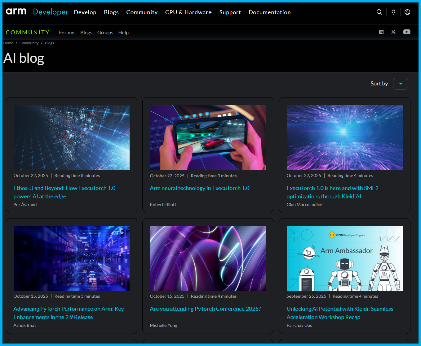
New layout of blog category pages
Light and dark mode display options
You can now switch between light and dark modes across all blog pages. Simply click the light bulb icon in the top right of the page to change between displays. The new display options improve readability in all lighting conditions and reduce eye strain. Whether you prefer a bright layout or a darker theme, the choice is now yours. Your selected mode will also be remembered for future visits, giving you a more personal reading experience each time you return.
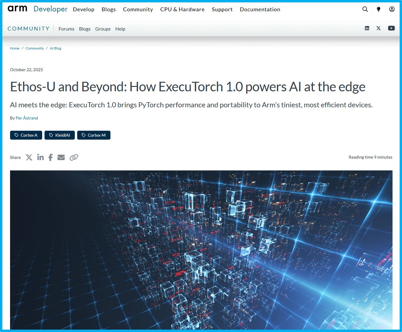
Arm Community blog post shown in light mode display
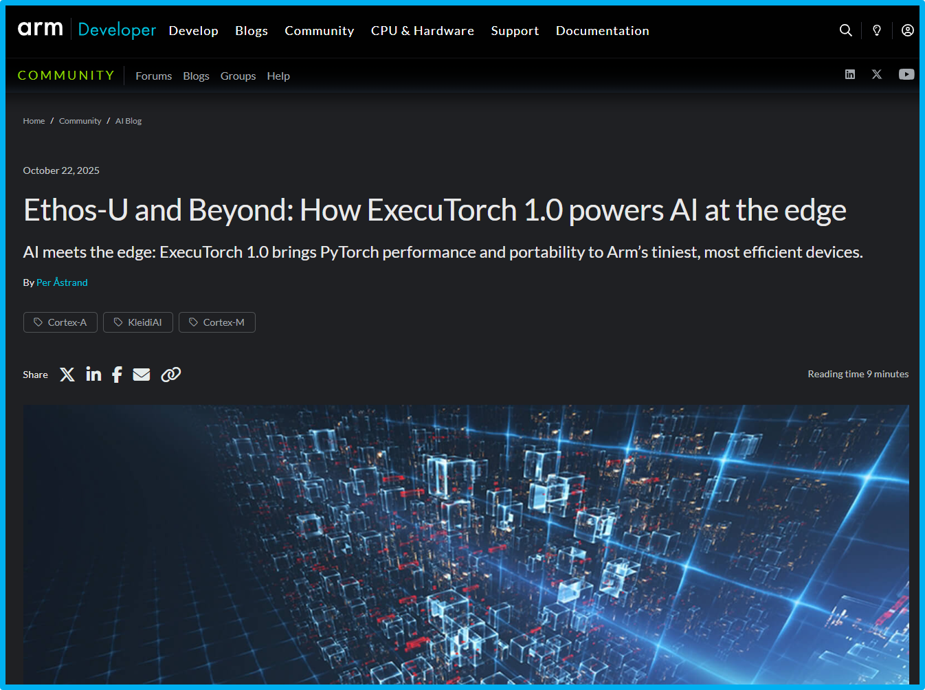
Arm Community blog post shown in dark mode display
Cleaner display of blog content
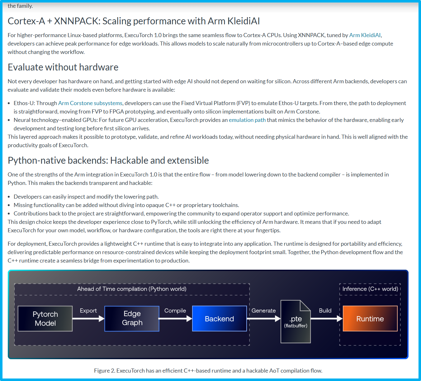
We have simplified the layout of every blog page to help you focus on what matters, the content. We removed unnecessary visuals, refined spacing, and optimized typography for better readability. The new design provides a balanced layout where content, images, and media flow naturally without distraction. This cleaner interface ensures that technical and community insights are easier to read and absorb on any device. One specific example is we have now collected all the post information (such as author, tags, summary, sharing links, and estimated read time at the top of the post.
All blog post information is now collected at the start of the post
One-column display (full page width)
All blog articles now use a one-column, full-width display. This change enhances legibility and consistency across different screen sizes, from large monitors to mobile devices. By removing the side column and extending the main content area, paragraphs and visuals have more space to breathe. This makes long technical articles and community features more comfortable to read and keeps the focus firmly on the story.
The old display layout of blog pages
The new display of blog pages
These updates are part of our ongoing effort to make the Arm Community a more welcoming and accessible space for everyone. We hope the new blog experience helps you discover, share, and engage with content more easily. As always, we welcome your feedback. Use the comment section below to let us know what you think and how we can continue to improve your experience.
Many thanks,
Oli
Arm Community Manager

Re-use is only permitted for informational and non-commercial or personal use only.
